
This article has been machine-translated from Chinese. The translation may contain inaccuracies or awkward phrasing. If in doubt, please refer to the original Chinese version.
Layout
- An algorithm that determines the size and position of content
- Calculated based on elements, containers, sibling nodes, content, and other information Introduction to the CSS basic box model - CSS | MDN (mozilla.org)
When laying out a document, the browser’s rendering engine represents all elements as rectangular boxes according to the CSS basic box model standard. CSS determines the size, position, and properties (such as color, background, border size, etc.) of these boxes. Each box is composed of four parts (or areas), defined by their respective edges. Corresponding to the four areas of the box, each box has four boundaries: Content Edge, Padding Edge, Border Edge, Margin Edge.
width
Specifies the content box width. Accepted values include length, percentage, auto, etc. Percentages are relative to the content box width.
height
Specifies the content box height. Accepted values include length, percentage, auto, etc. Percentages are relative to the content box height. Note that when using percentages for width/height, the content box must have a specified width/height, otherwise it won’t take effect.
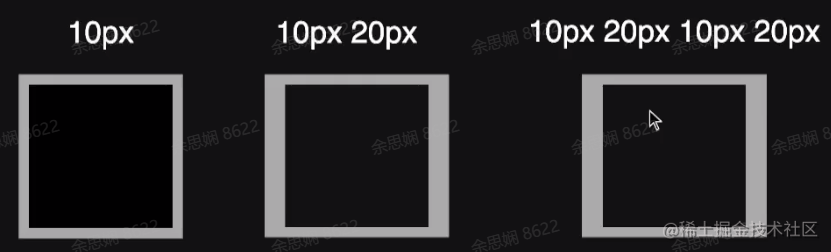
padding
Specifies the inner spacing in four directions. Percentages are relative to the container width. See padding - CSS | MDN (mozilla.org) for details.
- When only one value is specified, it applies to all four sides.
- When two values are specified, the first applies to top and bottom, the second to left and right.
- When three values are specified, the first applies to top, the second to right and left, the third to bottom.
- When four values are specified, they apply (clockwise) to top, right, bottom, and left.
margin
Specifies the outer spacing in four directions. Percentages are relative to the container width. See margin - CSS | MDN (mozilla.org) for details.
- When only one value is specified, it applies to all four sides.
- When two values are specified, the first applies to top and bottom, the second to left and right.
- When three values are specified, the first applies to top, the second to right and left, the third to bottom.
- When four values are specified, they apply (clockwise) to top, right, bottom, and left. margin collapse: Mastering margin collapsing - CSS | MDN (mozilla.org). When two adjacent elements’ outer margins overlap, vertical margin collapsing occurs, keeping only the largest margin value.
border
Specifies the border. border-width specifies width, border-style specifies type (solid/dashed), border-color specifies border color. Usually, all three are combined into the shorthand border. See border - CSS | MDN (mozilla.org) for MDN description.
- border trick: Making a triangle
- First, set different colors for the four borders. You can see the corners are divided by diagonal lines.
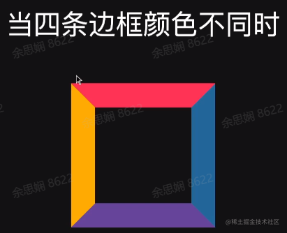
- When the container height and width are 0, it looks like this:

- If you set the other border colors to transparent, you can see a red triangle has been created.

- First, set different colors for the four borders. You can see the corners are divided by diagonal lines.
box-sizing
box-sizing - CSS | MDN (mozilla.org)
In the default definition of the CSS box model, the
widthandheightyou set for an element only apply to the content area. If the element has anyborderorpadding, the rendered box width and height on screen will include the border and padding values. This means you must always account for border and padding when adjusting an element’s width and height. This is especially annoying when implementing responsive layouts.
The box-sizing property can be used to adjust this behavior:
content-boxis the default value. If you set an element’s width to 100px, the content area will be 100px wide, and any border and padding width will be added to the final rendered element width.border-boxtells the browser that the border and padding values you set are included within the width. In other words, if you set an element’s width to 100px, that 100px includes its border and padding, and the actual content area width is width minus (border + padding). In most cases, this makes it easier to set an element’s width and height.
overflow
overflow - CSS | MDN (mozilla.org)
The CSS overflow property defines what to do when an element’s content is too large to fit in its block formatting context. It is a shorthand property for
overflow-xandoverflow-y.
Setting it to auto will show scrollbars when content overflows, otherwise no scrollbars are shown. For overflow to have effect, the block container must have a specified height (height or max-height) or white-space set to nowrap.
Block-level Elements
Block-level elements - HTML | MDN (mozilla.org)
Block-level elements occupy the entire horizontal space of their parent element (container), with vertical space equal to their content height. Browsers typically add a new line before and after block-level elements.
- Common examples: body, article, div, main, section, h1-h6, p, ul, li
- display: block
Inline Elements
Inline elements - HTML | MDN (mozilla.org)
An inline element only occupies the space bounded by its tags. Inline elements sit alongside other inline elements and do not use the box model’s width and height properties.
-
Common examples: span, em, strong, cite, section, code, etc.
-
display: inline
Speaking of the display property, see display - CSS | MDN (mozilla.org):
The
displayproperty sets an element’s inner and outer display types. The outer display type determines how the element participates in flow layout (block or inline); the inner display type controls how its children are laid out (e.g., flow layout, grid, or flex).
- block: block-level box
- inline: inline-level box
- inline-block: itself is inline and can be placed in inline boxes, but can have width and height set, and as a whole won’t be broken across multiple lines.
- none: completely ignored during layout
Normal Flow
- Root elements, floated elements, and absolutely positioned elements leave the normal flow; all other elements are in-flow. Boxes in normal flow participate in layout within a certain formatting context.
- Inline formatting context, Block formatting context, Table formatting context, Flex formatting context, Grid formatting context…
Inline Formatting Context (IFC)
Inline formatting context - CSS | MDN
The inline formatting context is part of a web page’s rendered result. In it, inline boxes are laid out one after another, with their order determined by the writing mode:
- For horizontal writing mode, boxes are arranged horizontally from left to right
- For vertical writing mode, boxes are arranged vertically from top to bottom
In the example below, the two (
<div>) elements with black borders form a block formatting context, where each word participates in an inline formatting context. In horizontal writing mode, boxes are arranged horizontally; in vertical writing mode, they are arranged vertically.
-
A container containing only inline boxes creates an IFC. The layout rules in an IFC are as follows:
- Boxes are placed horizontally in a line, wrapping when a line is full.
text-aligndetermines horizontal alignment within a line.vertical-aligndetermines vertical alignment of a box within a line.- Avoids floated elements.
-
A paragraph is actually a collection of line boxes arranged in the block direction.
-
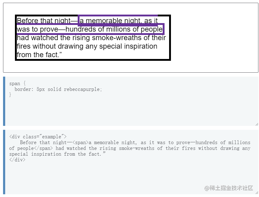
When an inline box is split across multiple lines, margins, borders, and padding do not take effect at the break point. In the example below, there is a (
<span>) element wrapping a series of words that spans two lines. You can see that the<span>’s border also breaks at the split point.
Block Formatting Context (BFC)
Block formatting context | MDN
- Block Formatting Context (BFC)
- Boxes are placed from top to bottom
- Vertical margins within a BFC will collapse (see margin collapse mentioned earlier)
- Margins of boxes within a BFC will not collapse with those outside
- A BFC will not overlap with floated elements
FlexBox
Basic concepts of flexbox | MDN
-
A new formatting context
-
Can control child boxes’:
- Flow direction (flex-direction)
- Default (
row): left to right -> row-reverse: right to left <-column: top to bottomcolumn-reverse: bottom to top
- Default (
- Layout order
- Box height and width
- Horizontal and vertical alignment (strictly speaking, alignment along the main axis and cross axis, see
justify-contentandalign-items) - Whether wrapping is allowed (
wrap,nowrap,wrap-reverse) - Other flex item properties (
flex-grow,flex-shrink,flex-basis), etc.
- Flow direction (flex-direction)
-
flex children create a BFC
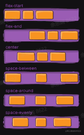
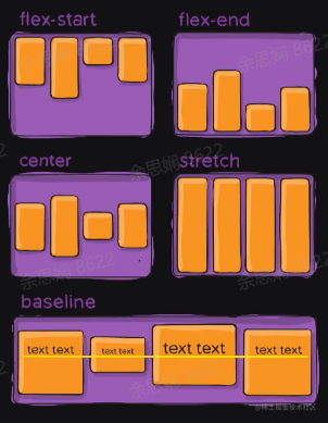
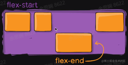
Let’s focus on main axis and cross axis alignment. With the default left-to-right (row) layout, the main axis is horizontal and the cross axis is vertical. The main axis alignment options (justify-content, initial value flex-start) are:
- flex-start: align at the start of the main axis
- flex-end: align at the end of the main axis
- center: center alignment on the main axis
- space-between: align at both ends of the main axis with space distributed between items
- space-around: add space on both sides while keeping element sizes unchanged
- space-evenly: equal space on both edges and between items
Cross axis alignment options (initial value stretch):
- flex-start: align at the start of the cross axis
- flex-end: align at the end of the cross axis
- center: center alignment on the cross axis
- stretch: stretch elements on the cross axis to fit the container
- baseline: align along the baseline
If you want to give a specific element in a flex container special treatment, you can set an align-self property on it, as shown:
order can set the order of elements in the layout.
What happens when the page is stretched or shrunk? How does the content in a flex container change?
-
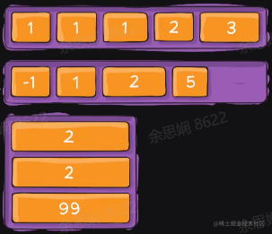
You can control expansion behavior when there is remaining space using flex-grow, and control shrinking behavior when space is insufficient using flex-shrink.
-
The
flex-growproperty can allocate space proportionally. If the first element has aflex-growvalue of 2 and the others have 1, the first element will take up 2/4 of the space, while the other two each take 1/4. -
flex-shrink, likeflex-grow, can be assigned different values to control how much flex elements shrink — elements with largerflex-shrinkvalues will shrink more than siblings with smaller values. -
flex-basis: the base length when there is no expansion or shrinking.
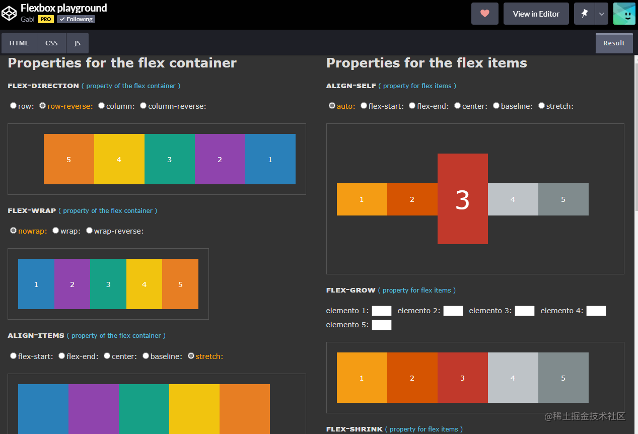
Regarding flex layout, I previously saw a demo project on CodePen that lets you explore the effect of each property. I highly recommend trying it yourself: Flexbox playground (codepen.io)
Grid Layout
Grid - Glossary | MDN (mozilla.org)
-
display: grid makes the element generate a block-level Grid container
-
You can use grid-template-related properties to divide the container into a grid
grid-template-rows: defines grid line names and grid track sizes based on grid rowsgrid-template-columns: defines grid line names and grid track sizes based on grid columns- You can define
minmax(min, max), a property for defining size ranges, greater than or equal to min and less than or equal to max. If max is less than min, the value is treated as min. The max value can use thefrgrid track factor, but the min value cannot. - You can also use the
frunit to define elastic factors for grid track sizes. Each track defined withfrwill proportionally share the remaining available space. When used inside aminmax(), it becomes an auto minimum (i.e.,minmax(auto, <flex>)). - Want elements to span multiple rows/columns?
- grid line
- grid area
- Use grid-template-columns-start/grid-template-columns-end, etc., which can be shortened to grid-area.
A small demo written following the lecture: Grid (codepen.io), also a straightforward example.
- First, set the container as a 4-row, 2-column grid
#container {
  width: 300px;
  height: 500px;
  display: grid;
  grid-template-columns: 1fr 1fr;
  grid-template-rows: 1fr 1fr 1fr 1fr;
}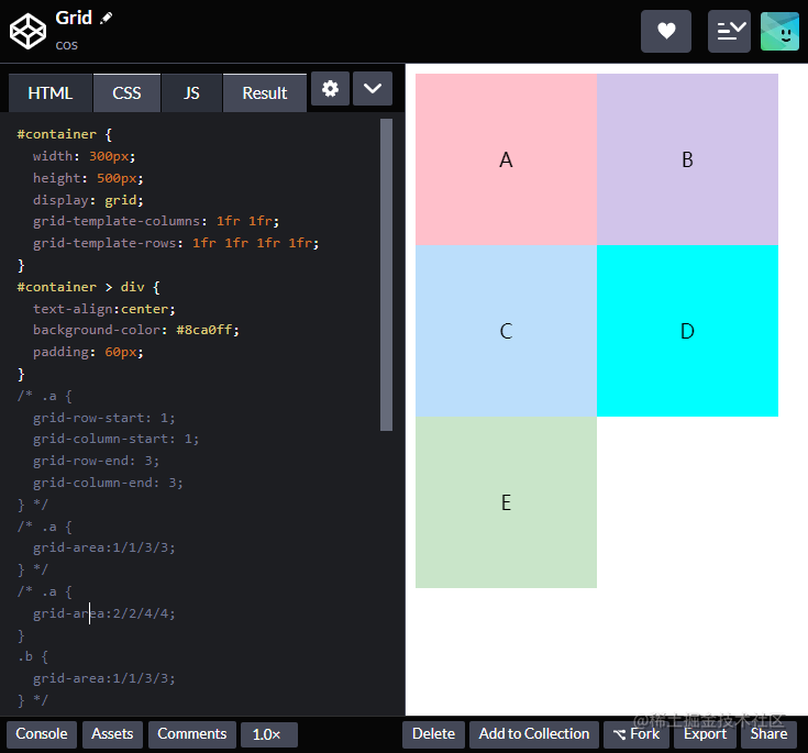
- Then set element A to start from grid line 1 to grid line 3 in rows, i.e., spanning 2 rows, and similarly spanning 2 columns, as shown:
.a {
  grid-row-start: 1;
  grid-column-start: 1;
  grid-row-end: 3;
  grid-column-end: 3;
}
This can be shortened to:
.a {
  grid-area: 1/1/3/3;
}
As you can see, A occupies two rows and two columns:

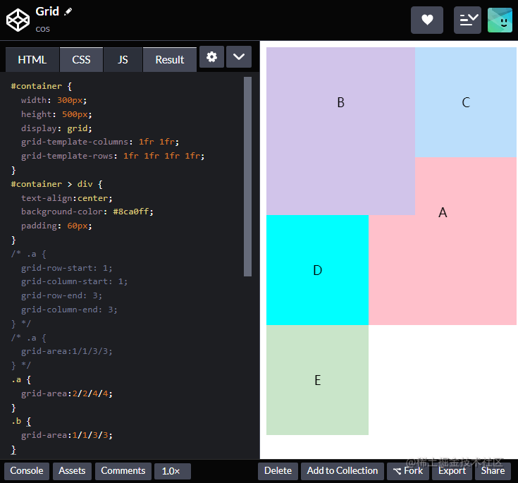
- Making some more changes: set A to rows/columns 2-4 (occupying rows/columns 2 and 3), and B to rows/columns 1-3 (occupying rows/columns 1 and 2):
.a {
  grid-area: 2/2/4/4;
}
.b {
  grid-area: 1/1/3/3;
}
Float
In the early days, text wrapping around images was achieved using float. Nowadays you only need a basic understanding. For details, see float - CSS | MDN (mozilla.org)
-
Float allows text and inline elements to wrap around it. Elements with the float property are removed from the normal document flow.
-
When an element is floated, it is removed from normal document flow and then shifted left or right until it touches the edge of its container or another floated element.
-
Note that if you want subsequent elements to forcibly move below any floated elements after using float, you must use the clear property.
position
The position property specifies the positioning method of an element in the document. The top, right, bottom, and left properties determine the element’s final position.
position has the following positioning types:
- static: default value, non-positioned element
- relative: offset relative to its original position, without leaving the document flow
- absolute: absolute positioning, positioned relative to the nearest non-static ancestor element
- fixed: absolutely positioned relative to the viewport
Relative Positioning
position
- Laid out in normal flow
- Offset relative to where it would normally be (top, left, bottom, right)
- Other elements in the flow are laid out as if it hadn’t been offset
Absolute Positioning
position
- Removed from normal flow
- Positioned relative to the nearest non-static ancestor
- For example, to add a badge to an icon, set the icon to position, then set the badge’s position to absolute and offset it.
- Does not affect the layout of in-flow elements
Suggestions and Reflections
- Make good use of MDN and World Wide Web Consortium (W3C) CSS specifications
- Stay curious, make good use of browser developer tools
- Keep learning, new CSS features keep emerging
This has been a review of my CSS learning. Regarding the layouts above, the key is to practice, look things up, and grow through practice. Once you use them enough, you naturally remember them. Also, when you see interesting front-end projects, study them and see how excellent projects handle their layouts.
喜欢的话,留下你的评论吧~