
This article has been machine-translated from Chinese. The translation may contain inaccuracies or awkward phrasing. If in doubt, please refer to the original Chinese version.
Basic Principles of Animation
What Is Animation
Animation is the process of creating the illusion of motion and change by rapidly displaying a sequence of images that differ minimally from each other.
— Wikipedia
- Fast
- Sequentially arranged
- Minimal differences between frames
- A process of creating "illusion"
History of Animation
Today, front-end animation technology has become widespread
-
Common front-end animation techniques
- Sprite animation, CSS animation, JS animation, SVG animation, and WebGL animation
-
Categorized by application
- UI animation, web-based game animation, and animated data visualization
The emergence of GIF and Flash once made them mainstream. Around the year 2000, Apple decided that Flash caused excessive CPU load and drained batteries faster, announcing the complete abandonment of Flash. All Apple devices saw significantly improved battery life. Today, web animation is primarily driven by CSS and JS animation.
Computer Animation
Computer Graphics
The foundation of computer vision, covering mathematical construction methods for points, lines, surfaces, volumes, and fields.
- Input, storage, and compression of geometric and graphical data.
- Algorithms for describing textures, curves, lighting and shadows, etc.
- Output of object graphics data (graphics interfaces, animation techniques), hardware and graphics interaction techniques.
- Related technical standards for graphics development software.
Computer animation is a branch of computer graphics, mainly including 2D and 3D animation. No matter how simple an animation is, it always requires defining two basic states: the start state and the end state. Without them, we cannot define interpolated states to fill the gap between the two.
Fast? Yes. Sequentially arranged? No. Minimal differences? No. Creating "illusion"? No.
As you can see, the animation above is only fast but doesn't create an illusion. This brings us to the concept of frame rate (gamers should be familiar with this)
-
Frame: In a sequence of continuously changing images, each individual image is a frame.
-
Frame rate: A measurement of the number of frames displayed within a given time period, typically measured in FPS (frames per second).
-
Frame rate and human vision: Generally, at 10-12 frames per second, people perceive the images as continuous. This phenomenon is called persistence of vision. For computer animations and games, anything below 30 FPS feels noticeably laggy. Currently, mainstream screens and graphics cards output at 60 FPS, which appears significantly smoother.
Now, let's fill in the gaps between the start and end points to make the animation appear continuous.
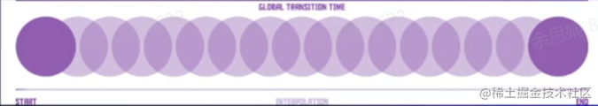
There are two ways to fill in the gaps:
- Tweened animation
- In traditional animation, the lead artist draws keyframes and hands them to the clean-up department, where in-between animators fill in the keyframes for delivery
- (By analogy, the browser acts as the in-between animator for front-end animation, such as
@keyframesandtransition)
- Frame-by-frame animation
- As the name suggests, every frame in the entire sequence is hand-drawn. (Such as CSS steps implementing sprite animation)
Categories of Front-End Animation
CSS Animation
CSS (Cascading Style Sheets) is a style sheet language used to describe HTML or XML (including XML dialects like SVG, MathML, XHTML). The animation property in CSS is a shorthand for animation-name, animation-duration, animation-timing-function, animation-delay, animation-iteration-count, animation-direction, animation-fill-mode, and animation-play-state.
animation-name
The animation-name property specifies a list of animations to apply. Each name represents an animation sequence defined by @keyframes. Its values are:
none(initial value) - A special keyword indicating no keyframes. It can deactivate an animation without changing the order of other identifiers, or deactivate cascading animation styles.IDENT- A string identifying the animation, composed of case-sensitive letters a-z, digits 0-9, underscores (_), and/or hyphens (-). The first non-hyphen character must be a letter; digits cannot precede letters; and two hyphens at the beginning are not allowed.
Multiple animation definitions are separated by commas.
/* Single animation */
animation-name: none;
animation-name: test_05;
animation-name: -specific;
animation-name: sliding-vertically;

/* Multiple animations */
animation-name: test1, animation4;
animation-name: none, -moz-specific, sliding;

/* Global values */
animation-name: initial
animation-name: inherit
animation-name: unset
animation-duration
The animation-duration property specifies the duration of one animation cycle. The default value is 0s, meaning no animation.
Its value is the duration of one animation cycle, in seconds (s) or milliseconds (ms). Values without units are invalid. You can also specify multiple values, which correspond one-to-one with animation-name.
Note: Negative values are invalid. The browser will ignore the declaration, though some early prefixed declarations treated negative values as 0s.
/* Single animation */
animation-duration: 6s
animation-duration: 120ms

/* Multiple animations */
animation-duration: 1s, 15s
animation-duration: 10s, 30s, 230ms
animation-timing-function
The animation-timing-function property defines the pacing of a CSS animation within each animation cycle. Possible values are one or more, and they correspond one-to-one with animation-name. CSS itself defines some easing functions that we can use to achieve ease-in and ease-out effects.
For keyframe animations, the timing function applies to a keyframe period rather than the entire animation cycle - from keyframe start to keyframe end.
An animation timing function defined within a keyframe block applies to that keyframe. If no timing function is defined for that keyframe, the timing function defined for the entire animation is used.
/* Keyword values */
animation-timing-function: ease;
animation-timing-function: ease-in;
animation-timing-function: ease-out;
animation-timing-function: ease-in-out;
animation-timing-function: linear;
animation-timing-function: step-start;
animation-timing-function: step-end;

/* Function values */
animation-timing-function: cubic-bezier(0.1, 0.7, 1, 0.1);
animation-timing-function: steps(4, end);
animation-timing-function: frames(10);

/* Multiple animations */
animation-timing-function: ease, step-start, cubic-bezier(0.1, 0.7, 1, 0.1);

/* Global values */
animation-timing-function: inherit;
animation-timing-function: initial;
animation-timing-function: unset;
animation-delay
animation-delay defines when the animation starts, i.e., the time between when the animation is applied to an element and when it begins to play. (In other words, how long before it starts.)
0s is the default value, meaning the animation executes immediately after being applied to the element. Otherwise, the value represents the time between when the animation style is applied to the element and when it starts executing.
A negative value causes the animation to start immediately, but from a certain point in its animation sequence. For example, if the value is set to -1s, the animation starts immediately from the 1-second position in its sequence.
If a negative value is specified for the animation delay and the starting value is implicit, the starting value is taken from the moment the animation is applied to the element.
animation-delay: 3s;
animation-delay: 2s, 4ms;
animation-iteration-count
animation-iteration-count defines how many times the animation runs before stopping. It can be 1 time or infinite loops.
-
infinitePlay the animation infinitely.
-
<number>The number of times the animation plays; the default is
1. You can use decimals to define loops to play a portion of an animation cycle: for example,0.5will play to the halfway point of the animation cycle. Negative values are not allowed.
/* Keyword value */
animation-iteration-count: infinite;

/* Numeric values */
animation-iteration-count: 3;
animation-iteration-count: 2.4;

/* Multiple values */
animation-iteration-count: 2, 0, infinite;
Its multi-value behavior differs from duration - it switches its iteration count at the beginning and end of each animation.
animation-direction
The animation-direction property indicates whether the animation should play in reverse.
-
normal(default)The animation plays forward in each cycle. In other words, each time the animation cycle ends, the animation resets to the starting point and plays again.
-
alternateThe animation alternates direction on each cycle. When running in reverse, the animation steps backward, and timing functions are also reversed. For example,
ease-inbecomesease-outwhen reversed. The count depends on whether the starting iteration is odd or even. -
reversePlays the animation in reverse, running from end to beginning each cycle.
-
alternate-reverseAlternates in reverse. Starts alternating from reverse.
The animation runs in reverse the first time, then forward the next time, and so on. Counting starts from 1 to determine odd or even iterations.
animation-direction: normal
animation-direction: reverse
animation-direction: alternate
animation-direction: alternate-reverse
animation-direction: normal, reverse
animation-direction: alternate, reverse, normal
animation-fill-mode
The animation-fill-mode property sets how CSS animation applies styles to its target before and after execution.
/* Single animation */
animation-fill-mode: none;
animation-fill-mode: forwards;
animation-fill-mode: backwards;
animation-fill-mode: both;

/* Multiple animations */
animation-fill-mode: none, backwards;
animation-fill-mode: both, forwards, none;-
none(default)When the animation is not executing, no styles will be applied to the target. The element is displayed using the CSS rules already assigned to it. This is the default value.
-
forwardsThe target retains the computed values from the last keyframe encountered during execution. The last keyframe depends on the values of
animation-directionandanimation-iteration-count(essentially, whatever the last keyframe looks like is how it will remain). -
backwardsThe animation will immediately apply the values defined in the first keyframe when applied to the target, and retain this value during the
animation-delayperiod. (This is important for delays.) The first keyframe depends onanimation-direction:animation-directionfirst relevant keyframenormaloralternate``0%orfrom``reverseoralternate-reverse``100%orto -
bothThe animation follows the rules of both
forwardsandbackwards, extending animation properties in both directions. (It combines both behaviors.)
Note: When you specify multiple comma-separated values on
animation-*properties, they are assigned to the animations specified in theanimation-nameproperty in different ways based on the number of values. For more information, see Setting multiple animation property values.
animation-play-state
The animation-play-state property defines whether an animation is running or paused. You can query it to determine whether the animation is currently running. Additionally, its value can be set to pause and resume animation playback. Resuming a paused animation will resume from where it was paused, not from the beginning of the animation sequence.
-
runningThe animation is currently running.
-
pausedThe animation is currently paused.
/* Single animation */
animation-play-state: running;
animation-play-state: paused;

/* Multiple animations */
animation-play-state: paused, running, running;

/* Global values */
animation-play-state: inherit;
animation-play-state: initial;
animation-play-state: unset;
An example: CSS BEER! (codepen.io)
I checked out this developer's other projects - they're all very interesting! #codevember - 19 - CSS Eggs (codepen.io), Periodic Table of Elements - HTML/CSS (codepen.io)
transform API
The transform property allows you to rotate, scale, skew, or translate a given element. This is achieved by modifying the coordinate space of the CSS visual formatting model.
transform-origin specifies the origin position, with the default being center.
The transform property can be specified as the keyword value none or one or more <transform-function> values.
-
One or more CSS transform functions to apply. Transform functions are multiplied from left to right, meaning composite transforms are effectively applied from right to left.
-
scale(scaling) - Note that its center istransform-origin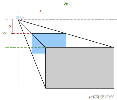
// Scale down to 50% along x-axis transform: scale(0.5); // Scale down to 50% along x-axis, scale up to 2x along y-axis transform: scale(0.5, 2); -
rotate(rotation) - Rotates the element around the origin (as specified bytransform-origin) without deforming it. The amount of rotation is defined by the specified angle; if positive, the motion is clockwise, if negative, counterclockwise. A 180-degree rotation is called a point reflection.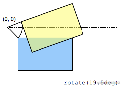
transform: rotate(30deg); -
skew(skewing) - Parameters represent skew angles in degrees (deg).One parameter means the horizontal skew angle (ax);
Two parameters mean horizontal and vertical (ax, ay).
transform: skew(ax)
transform: skew(ax, ay)
-
-
noneNo transform is applied.
Note: It can only transform elements positioned by the box model. As a rule of thumb, if an element has display: block, it is positioned by the box model.
The transition property creates transition animations triggered when the DOM is loaded or a class changes. It is a shorthand for transition-property, transition-duration, transition-timing-function, and transition-delay.
/* Apply to 1 property */
/* property name | duration */
transition: margin-right 4s;

/* property name | duration | delay */
transition: margin-right 4s 1s;

/* property name | duration | timing function */
transition: margin-right 4s ease-in-out;

/* property name | duration | timing function | delay */
transition: margin-right 4s ease-in-out 1s;

/* Apply to 2 properties */
transition:
  margin-right 4s,
  color 1s;

/* Apply to all changed properties */
transition: all 0.5s ease-out;

/* Global values */
transition: inherit;
transition: initial;
transition: unset;
Implementing Animation with Keyframes
The @keyframes at-rule controls intermediate steps in a CSS animation sequence by defining styles for keyframes (or waypoints). Compared to transitions, keyframes can control intermediate steps of an animation sequence.
// Slide in from the left
@keyframes slidein {
  from {
    transform: translateX(0%);
  }
  to {
    transform: translateX(100%);
  }
}
//
@keyframes identifier {
  0% {
    top: 0;
  }
  50% {
    top: 30px;
    left: 20px;
  }
  50% {
    top: 10px;
  }
  100% {
    top: 0;
  }
}
Here's an example: my CSS Animation practice (codepen.io)
@keyframes identifier {
  0% {
    top: 0;
    left: 0;
  }
  50% {
    top: 60%;
    left: 60%;
  }
  100% {
    top: 0;
    left: 0;
  }
}
@keyframes slidein {
  from {
    transform: translateX(0%);
  }
  to {
    transform: translateX(100%);
  }
}
body > div {
  position: absolute;
  display: flex;
  align-items: center;
  justify-content: center;
  color: #fafafa;
  background-color: #141414;
  padding: 10px;
  width: 20%;
  height: 20%;
  /*   Top-left to bottom-right, duration 5s, delay 1s, infinite loop */
  /*   animation: identifier 5s linear 1s infinite; */
  /*   Slide right, duration 1s, twice */
  animation: slidein 1s 2;
}
To summarize:
CSS animation advantages: Simple, efficient, declarative. Not dependent on the main thread, uses hardware acceleration (GPU), and easily controls keyframe animation play and pause.
Disadvantages: Cannot dynamically modify or define animations, animations with different content cannot be synchronized, and multiple animations cannot be stacked on top of each other. Suitable scenarios: Simple H5 activity/promotional pages. Recommended libraries: Animate.css, CSShake, etc.
SVG Animation
SVG is a vector graphics description language based on XML. It works well with CSS and JS. There are typically three ways to implement SVG animation: SMIL, JS, CSS
- SMIL: Synchronized Multimedia Integration Language
- Conclusion: Browser compatibility is not ideal, so we won't discuss it further here. There is a polyfill solution: https://github.com/ericwilligers/svg-animation
- Using JS to manipulate SVG animation goes without saying. There are many ready-made libraries available, such as the classic Snap.svg and anime.js, which allow us to quickly create SVG animations. Of course, besides these libraries, HTML itself has a native Web Animation implementation. Here are two examples from the instructor:
- Text morphing: https://codepen.io/jiangxiang/pen/MWmdjeY
- Writing animation with Path: SVG Writing Animation (codepen.io)
The implementation principle of the first animation:
Text Dissolve Principle - filter
The filter property applies graphical effects like blur or color shift to an element. Filters are typically used to adjust the rendering of images, backgrounds, and borders. Basic example: https://codepen.io/jiangxiang/pen/XWeQGQK
- Gradually reduce blur, and when the blur is almost gone, set its opacity to 0 to hide it - this creates a dissolve effect.
JS Stroke Principle - stroke
stroke-dashoffset and stroke-dasharray are used together to achieve a stroke effect.
stroke-dasharray controls the pattern of dashes and gaps used to stroke paths. It's a list of numbers separated by commas or whitespace, specifying the lengths of dashes and gaps. If an odd number of values is provided, the list is repeated once to yield an even number of values. Thus, 5,3,2 is equivalent to 5,3,2,5,3,2.
stroke-dashoffset specifies the distance from the start of the path to the beginning of the dash pattern.
Instructor's example: stroke-dasharray&stroke-dashoffset (codepen.io)
// 5px solid 5px gap x1y1 -> x2y2
<line stroke-dasharray="5, 5" x1="10" y1="10" x2="190" y2="10" />
// 5px solid 10px gap
<line stroke-dasharray="5, 10" x1="10" y1="30" x2="190" y2="30" />
// 10px solid 5px gap
<line stroke-dasharray="10, 5" x1="10" y1="50" x2="190" y2="50" />
// 5px solid 1px gap...
<line stroke-dasharray="5, 1" x1="10" y1="70" x2="190" y2="70" />
<line stroke-dasharray="1, 5" x1="10" y1="90" x2="190" y2="90" />
<line stroke-dasharray="0.9" x1="10" y1="110" x2="190" y2="110" />
<line stroke-dasharray="15, 10, 5" x1="10" y1="130" x2="190" y2="130" />
<line stroke-dasharray="15, 10, 5, 10" x1="10" y1="150" x2="190" y2="150" />
<line stroke-dasharray="15, 10, 5, 10, 15" x1="10" y1="170" x2="190" y2="170" />
// Total length 180, 180 solid 180 gap (all solid). Changing the dashoffset value creates the stroke effect
<line stroke-dasharray="180" stroke-dashoffset的值就可以实现笔画效果="0" x1="10" y1="190" x2="190" y2="190" />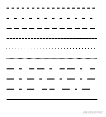
For simple shapes like straight lines, you can directly know the total length and implement the stroke effect by initializing dashoffset. But what about irregular shapes?
Use path.getTotalLength();
path routes - defined by the d attribute. Uppercase letters are followed by absolute coordinates x,y; lowercase letters are relative coordinates dx,dy. M/m draws the starting point.
-
L/l draws a line segment. C/c draws a Bezier curve. Z/z connects the current point to the starting point with a straight line.
-
Calculate path length - path.getTotalLength();
-
Calculate coordinates of a point on a path - path.getPointAtLength(lengthNumber);
Instructor's example: SVG using stroke-dashoffset and stroke-dashoffset for stroke effect (codepen.io)
-
SVG animation advantages: Implements animation through vector elements, providing good clarity across different screen sizes. Can achieve special effects: text tracing, morphing, ink spreading, etc.
-
Disadvantages: The usage is relatively complex, and excessive use may cause performance issues.
JS Animation
JS can implement complex animations, manipulating CSS, SVG, or drawing on canvas animation APIs.
How to Choose?
CSS Implementation
-
Advantages
- Browsers optimize CSS3 animations, giving CSS3 animations a slight performance advantage (creating a new layer to run animations)
- CSS3 animation code is relatively simple
-
Disadvantages
-
Not flexible enough for animation control
-
Browser compatibility issues
-
Some animations cannot be achieved (parallax effects, scroll animations)
-
-
Simple animations can all be done with CSS
JS Implementation
-
Advantages
-
Flexible to use. When defining a keyframe sequence, you can adjust parameters based on different conditions (JS animation functions), changing how the animation works. (CSS would have significant code redundancy)
-
Compared to CSS keyframes which have coarser granularity, CSS's built-in timing functions are limited, and JS can compensate for this.
-
CSS has difficulty handling transitions between more than two states (either using keyframes or multiple delayed animations. Add looping, pausing, reversing, etc., and complexity becomes extremely high)
-
-
Disadvantages
- Uses JS runtime, making optimization less straightforward than CSS, where CSS optimization methods are fixed.
- For browsers with poor performance and compatibility, CSS can gracefully degrade, while JS requires additional compatibility code, affecting the bundle size.
Summary:
- Use CSS for small, independent state changes in UI elements.
- Use JavaScript when you need extensive control over animations.
- In specific scenarios, use SVG, which can be manipulated with CSS or JS. (Such as the dissolve and stroke effects described above)
Implementing Front-End Animation
JS Animation Function Encapsulation
function animate({ easing, draw, duration }) {
  let start = performance.now(); // Get current time
  return new Promise((resolve) => {
    requestAnimationFrame(function animate(time) {
      let timeFraction = (time - start) / duration;
      if (timeFraction > 1) timeFraction = 1;

      let progress = easing(timeFraction);

      draw(progress);

      if (timeFraction < 1) {
        requestAnimationFrame(animate);
      } else {
        resolve();
      }
    });
  });
}
This function first gets the current system time using performance.now(), which slowly increases at a constant rate, unaffected by system time. It represents time as a floating-point number with precision up to microsecond level and is difficult to tamper with. Parameter descriptions:
-
draw - Drawing function
-
Think of it as a paintbrush. As the function executes, this paintbrush function is called repeatedly, receiving the current progress. The progress depends on the easing value; if it increases linearly, it ranges from 0 to 1. For example:
const ball = document.querySelector('.ball');
const draw = (progress) => {
  ball.style.transform = `translate(${progress}px, 0)`;
};
-
-
easing - Easing function
-
The easing function changes (or distorts) the animation's timing, making it linear/non-linear, or multi-dimensional. For example:
easing(timeFraction) {
    return timeFraction ** 2;   // timeFraction squared
}
-
-
duration - Duration, in milliseconds
-
Why return a Promise:
-
Promise is an object representing the eventual completion or failure of an asynchronous operation.
-
Animations can be sequential. Promise supports sequential calling through the then function or await, making it easy to get the animation's final state.
-
-
This animation function implements a finite-duration animation wrapper.
-
RequestAnimationFrame (rAF) vs SetTimeout vs SetInterval
-
Use requestAnimationFrame! Why?
This built-in method lets you set a callback function to run when the browser is ready to repaint. Usually this happens quickly, but the exact timing depends on the browser.
When the page is in the background, setTimeout and setInterval have no repainting at all, so the callback won't run: the animation is paused and won't consume resources. Reference: javascript - requestAnimationFrame loop not correct FPS - Stack Overflow
Reflow: If part of the render tree is updated and the dimensions change, a reflow occurs.
Repaint: Some nodes need updating but don't change other geometric shapes. For example, changing an element's visibility, outline, or background color causes a repaint.
-
Simple Animation
The core idea of JS animation:
delta-r = delta-v * delta-t
Simply put: r is distance, v is velocity, t is time. Scaling through proportional coefficients ensures the animation feels realistic.
For example: uniform motion. The instructor's example is very comprehensive: JS Animation Function Encapsulation (codepen.io) (definitely worth checking out!)
const ball = document.querySelector('.ball');
const draw = (progress) => {
  ball.style.transform = `translate(${progress}px, 0)`;
};
// Uniform motion along x-axis
animate({
  duration: 1000,
  easing(timeFraction) {
    return timeFraction * 100;
  },
  draw,
});
- Gravity: h = g * t2
t^2^// Gravity
const gravity = () => {
  const draw = (progress) => { // Height 500
    ball.style.transform = `translate(0, ${500 * (progress - 1)}px)`;
  };
  animate({
    duration: 1000,
    easing(timeFraction) {
      return timeFraction ** 2; // t squared
    },
    draw,
  });
};

- Friction: time becomes 2t - t2
// Friction
const friction = () => {
  // Initial height 500px
  const draw = (progress) => {
    ball.style.transform = `translate(0, ${500 * (progress - 1)}px)`;
  };
  animate({
    duration: 1000,
    easing(timeFraction) {
      // Initial velocity coefficient of 2
      return timeFraction * (2 - timeFraction);
    },
    draw,
  });
};
- Projectile motion (uniform along x-axis, accelerating along y-axis) - The y-axis is similar to the gravity t2 while x-axis velocity remains constant.
// Projectile motion x
const horizontalMotion = () => {
  const draw = (progress) => {
    ball.style.transform = `translate(${500 * progress.x}px, ${500 * (progress.y - 1)}px)`;
  };

  // Two directions: uniform along x-axis, accelerating along y-axis
  animate({
    duration: 1000,
    easing(timeFraction) {
      return {
        x: timeFraction,
        y: timeFraction ** 2,
      };
    },
    draw,
  });
};
There are many more. To add more, simply add new properties to the object returned by easing, such as rotation:
-
Rotation + Projectile motion
// Rotation + Projectile motion
const horizontalMotionWidthRotate = () => {
  const draw = (progress) => {
    ball.style.transform = `translate(${500 * progress.x}px, ${500 * (progress.y - 1)}px) rotate(${2000 * progress.rotate}deg)`; // 2000 is also a scaling coefficient
  };

  // Two directions: uniform along x-axis, accelerating along y-axis
  animate({
    duration: 2000,
    easing(timeFraction) {
      return {
        x: timeFraction,
        y: timeFraction ** 2,
        rotate: timeFraction,
      };
    },
    draw,
  });
};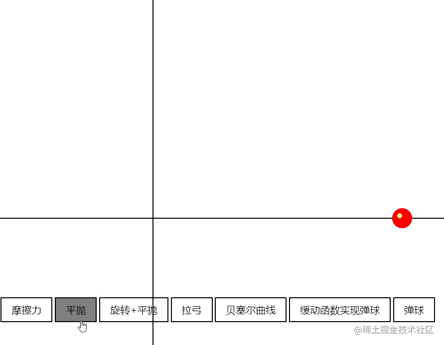
-
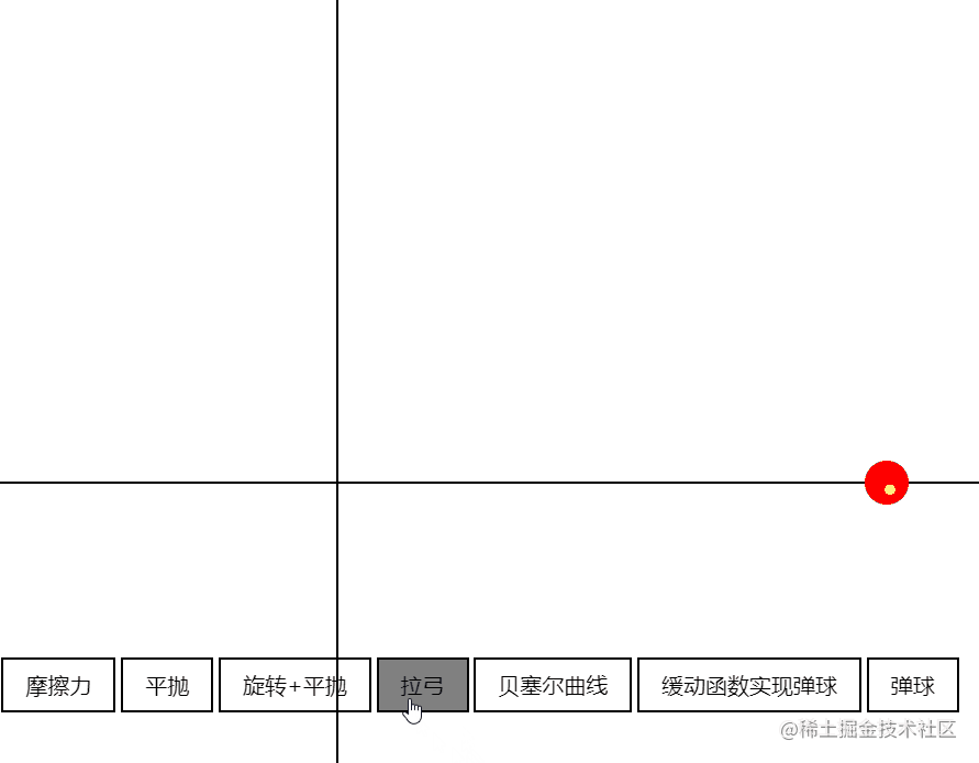
Bow and arrow (uniform along x-axis, initial negative acceleration along y-axis)
// Bow and arrow
const arrowMove = () => {
  // Abstracted: initial value is 2, becomes positive 1 at a certain threshold and increases uniformly
  const back = (x, timeFraction) => {
    return Math.pow(timeFraction, 2) * ((x + 1) * timeFraction - x);
  };
  const draw = (progress) => {
    ball.style.transform = `translate(${200 * progress.x}px, ${-500 * progress.y}px)`;
  };
  animate({
    duration: 1000,
    easing(timeFraction) {
      return {
        x: timeFraction,
        y: back(2, timeFraction),
      };
    },
    draw,
  });
};
-
Bezier curves cubic-bezier(0,2.11,1,.19) - cubic-bezier.com, Animated Bezier Curves - Jason Davies
- PS: This is where it starts to get hardcore
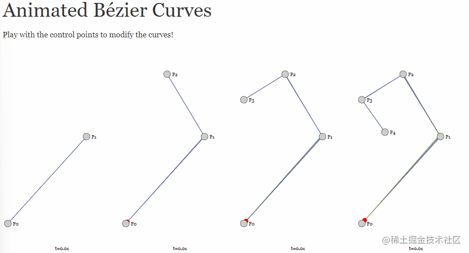
// Bezier
const bezier = () => {
  const bezierPath = (x1, y1, x2, y2, timeFraction) => {
    const x =
      3 * x1 * timeFraction * (1 - timeFraction) ** 2 + 3 * x2 * timeFraction ** 2 * (1 - timeFraction) + timeFraction ** 3;
    const y =
      3 * y1 * timeFraction * (1 - timeFraction) ** 2 + 3 * y2 * timeFraction ** 2 * (1 - timeFraction) + timeFraction ** 3;
    return [x, y];
  };

  const draw = (progress) => {
    const [px, py] = bezierPath(0.2, 0.6, 0.8, 0.2, progress);
    // Actually drawn in two dimensions
    ball.style.transform = `translate(${300 * px}px, ${-300 * py}px)`;
  };

  animate({
    duration: 2000,
    easing(timeFraction) {
      return timeFraction * (2 - timeFraction);
    },
    draw,
  });
};
Complex Animation
-
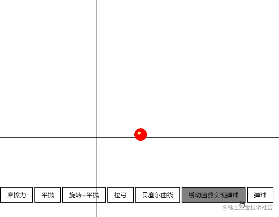
Bouncing ball (easing function implementation / auto-decay implementation)
- Go directly to the instructor's example: JS Animation Function Encapsulation (codepen.io). The auto-decay here fills a gap from earlier: why use Promise. When each execution completes, the handle is passed back to the function above to determine whether there is velocity decay, until the velocity reaches 0 and it automatically ends.
Auto-decay: More complex
-
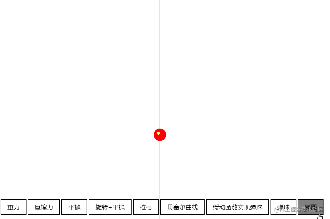
Elliptical motion
-
Just apply the formula: x = acos(a), y = bsin(a)
// Ellipse
const ellipsis = () => {
  const draw = (progress) => {
    const x = 150 * Math.cos(Math.PI * 2 * progress);
    const y = 100 * Math.sin(Math.PI * 2 * progress);
    ball.style.transform = `translate(${x}px, ${y}px)`;
  };

  animate({
    duration: 2000,
    easing(timeFraction) {
      return timeFraction * (2 - timeFraction);
    },
    draw,
  });
};
-
Related Practice Resources
Animation code examples:
- CodePen can provide lots of design inspiration
- CodeSandbox convenient for importing SDKs
Design websites:
- Dribbble - Discover the World's Top Designers & Creative Professionals
- I personally recommend Figma: Figma
Animation creation tools (generally used by UE/UI designers):
- 2D: Animate CC, After Effects
- 3D: Cinema 4D, Blender, Autodesk Maya
SVG:
-
Snap.SVG - JavaScript library for modern SVG graphics
-
Svg.js - A lightweight library for manipulating and animating SVG.
JS:
-
GSAP - JavaScript animation library.
-
TweenJS - A simple but powerful JavaScript tweening/animation library. Part of the CreateJS library suite.
-
Velocity - Accelerated JavaScript animation.
CSS:
- Animate.css - A cross-browser library of CSS animations. Easy to use like a simple thing.
canvas:
-
EaselJS - EaselJS is a library for building high-performance interactive 2D content in HTML5
-
Fabric.js - JavaScript canvas library with animation support.
-
Paper.js - The Swiss Army Knife of vector graphics scripting
-
Scriptographer - Ported to JavaScript and browsers using HTML5
Canvas.
-
Pixijs - Create beautiful digital content using the fastest, most flexible 2D WebGL renderer.
In actual work, the task is usually to convert animation frames/design files from UI designers into code.
-
When front-end developers need to design and develop entirely on their own:
- Use pre-built animation libraries, making trade-offs based on development cost and user experience.
-
When designers aren't very available:
- Clarity, image formats can be specified, and animations should ideally come with examples or similar reference cases. Sprite resources may need compression help. (Mobile resource adaptation, etc.)
-
When design resources are abundant:
-
Request designers to export files in lottie format
Lottie is a library available for Android, iOS, Web, and Windows,
It parses AE animations through Bodymovin and exports JSON files that can render animations on mobile and web platforms.
-
import lottie from 'lottie-web';
this.animation = lottie.loadAnimation({
  container: this.animationRef.current,
  renderer: 'svg',
  loop: false,
  autoplay: false,
  aninationData: dataJson,
  path: URL,
});
Optimization
-
Performance perspective
- Key point: Reduce repaints and reflows - these are the most time-consuming stages in the entire pipeline.
The general page rendering process is JS -> CSS -> Calculate Styles -> Layout -> Paint -> Composite Render Layers.
Among these, Layout (reflow) and Paint (repaint) are the most time-consuming stages, so we try to avoid them. From a performance perspective, the ideal rendering pipeline has no layout and paint stages, and only needs to composite render layers.
- You can check which CSS properties trigger which stages through CSS Triggers.
Recommendations
- In practical applications, the simplest point to note is: don't use display to trigger animations, because it causes Layout and Paint stages. Toggling class names is already a very good approach.
PS: Good to know! I'll go fix mine right away.
- CSS3 hardware acceleration, also known as GPU acceleration, uses the GPU for rendering to reduce CPU operations. Since CSS properties like transform in the GPU don't trigger repaint, this can significantly improve web page performance. The following CSS properties can trigger hardware acceleration:
- transform
- opacity
- filter
- Will-change
- If some elements don't need the above properties but need to trigger hardware acceleration, you can use tricks to coax the browser into enabling hardware acceleration.
- Algorithm optimization - Using linear functions instead of real calculations - Geometry model optimization - Collision detection optimization - Memory/cache optimization - Off-screen drawing
Summary and Reflections
Today's class was also very hardcore, covering the basic principles of front-end animation, categories of front-end animation, and how to implement them, along with related resources and practical methods. It gave me a deeper understanding of front-end animation, and the resource recommendations at the end were very helpful.
Most of the content cited in this article comes from instructor Jiang Xiang's class and MDN (I spent a long time looking through MDN for CSS animation property information - it's very comprehensive and has vivid examples, highly recommended).
喜欢的话,留下你的评论吧~