
This article has been machine-translated from Chinese. The translation may contain inaccuracies or awkward phrasing. If in doubt, please refer to the original Chinese version.
Introduction
In modern front-end development, floating elements play an increasingly important role. They provide users with additional interactions and information without affecting the overall page layout. Floating UI is a JavaScript library designed to make positioning and creating floating elements easy. With it, you can effortlessly control the position and interaction behavior of floating elements, thereby improving the user experience.
If you’re looking for a simple, out-of-the-box floating element solution, Floating UI may not be the best choice for you. The library’s primary goal is to provide anchor positioning functionality rather than pre-built styles or other advanced interactions. However, if you’re proficient in React and want to use such a highly customizable library, you’ll be able to make great use of it.
This library is intentionally “low-level” — its sole goal is to provide “anchor positioning.” Think of it as a polyfill for a missing CSS feature. It does not provide pre-built styles, and user interactions are only available for React users. If you’re looking for simple, ready-to-use functionality, you may find other libraries more suitable for your use case.
I’d rather call this article a sharing of my experience using Floating UI in React — specifically about using the library in React — rather than a tutorial. In practice, I found that Floating UI’s documentation and examples are already quite thorough. However, since there’s very little Chinese-language material on Floating UI, I wanted to document my experience for future reference, and hopefully it can provide some help and guidance for those who need it. (Of course, the fastest route is always to read the English documentation and examples directly and look up API usage.)
Installation
You can install Floating UI via a package manager or CDN. If you’re using npm, yarn, or pnpm, run the following command:
npm install @floating-ui/domIf you’re using a CDN, add the following tag to your HTML file:
<script src="https://cdn.jsdelivr.net/npm/@floating-ui/dom"></script>For more information, see: Getting Started | Floating UI
Installing for React
To use it in React, simply install the @floating-ui/react package:
yarn add @floating-ui/reactPopover
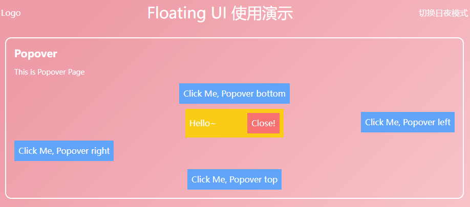
In this article, I’ll share how to use Floating UI to create a common floating UI component — the Popover. A Popover is a common floating UI component that typically appears when a user hovers over or clicks on an element, providing additional information or options.
Demo
With the following guide, you can easily build a click-triggered popover/popup layer, as shown below. Demo link: CodeSandbox
useFloating
First up is the core hook — useFloating
The useFloating hook provides positioning and context for floating elements. We need to pass in some information:
open: The open state of the popover.onOpenChange: A callback function invoked when the popover opens or closes. Floating UI uses this internally to update itsisOpenstate.placement: The position of the floating element relative to the reference element. The default position is'bottom', but you may want to place the tooltip at any position relative to the button. For this, Floating UI has aplacementoption.- Available base positions are
'top','right','bottom', and'left'. - Each of these base positions has
-startand-endalignment variants. For example,'right-start'or'bottom-end'. These allow you to align the tooltip with the edge of the button rather than centering it.
- Available base positions are
middleware: Import and pass middleware into an array to ensure the popover stays on screen, regardless of where it ends up being placed.autoPlacement: Useful when you don’t know which position best suits the floating element, or don’t want to specify it explicitly.- Middleware | Floating UI: Other middleware — see the docs, including offset (set offset), arrow (add a small arrow), shift (move the floating element along the specified axis to keep it visible), flip (flip the floating element’s position to keep it visible), inline (improve positioning for inline reference elements spanning multiple lines), and other useful middleware.
whileElementsMounted: Only updates the position when necessary, once both the reference element and floating element are mounted, ensuring the floating element stays anchored to the reference element.- autoUpdate: If the user scrolls or resizes the screen, the floating element may become detached from the reference element, so its position needs to be updated again to maintain anchoring.
import { useFloating, autoUpdate, offset, flip, shift } from '@floating-ui/react';

function Popover() {
  const [isOpen, setIsOpen] = useState(false);

  const { x, y, strategy, refs, context } = useFloating({
    open: isOpen,
    onOpenChange: setIsOpen,
    middleware: [offset(10), flip(), shift()],
    placement: 'top',
    whileElementsMounted: autoUpdate,
  });
}
Interaction hooks - useInteractions
Use
useInteractionsto pass in configuration objects that extend the floating element with additional functionality such as open/close behaviors or screen reader accessibility. In this example,useClick()adds the ability to toggle the popover open or closed when clicking the reference element.useDismiss()adds the ability to close the popover when the user presses theesckey or clicks outside of it.useRole()adds the correctARIAattributes for adialogto both the popover and the reference element. Finally,useInteractions()merges all their props into prop getters that can be used for rendering.[^1]
These are configuration objects that extend the floating element with additional functionality such as open/close behaviors or screen reader accessibility.
import {
  // ...
  useClick,
  useDismiss,
  useRole,
  useInteractions,
} from '@floating-ui/react';

function Popover() {
  const [isOpen, setIsOpen] = useState(false);

  const { x, y, reference, floating, strategy, context } = useFloating({
    open: isOpen,
    onOpenChange: setIsOpen,
    middleware: [offset(10), flip(), shift()],
    whileElementsMounted: autoUpdate,
  });

  const click = useClick(context);
  const dismiss = useDismiss(context);
  const role = useRole(context);

  // Merge all the interactions into prop getters
  const { getReferenceProps, getFloatingProps } = useInteractions([click, dismiss, role]);
}useClick()adds the ability to toggle the popover open or closed when clicking the reference element.useDismiss()adds the ability to close the popover when the user presses theesckey or clicks outside of it.useRole()adds the correctARIAattributes for adialogto both the popover and the reference element.
Finally, useInteractions() merges all their props into prop getters that can be used for rendering.
Rendering
Now that we’ve set up all the variables and hooks, we can render our elements.
function Popover() {
  // ...
  return (
    <>
      <button ref={refs.setReference} {...getReferenceProps()}>
        Reference element
      </button>
      {isOpen && (
        <FloatingFocusManager context={context} modal={false}>
          <div
            ref={refs.setFloating}
            style={{
              position: strategy,
              top: y ?? 0,
              left: x ?? 0,
              width: 'max-content',
            }}
            {...getFloatingProps()}
          >
            Popover element
          </div>
        </FloatingFocusManager>
      )}
    </>
  );
}getReferencePropsandgetFloatingProps, returned byuseInteractions, are spread onto the relevant elements. They contain props such asonClick,aria-expanded, and others.<FloatingFocusManager />is a component that manages popover focus for modal and non-modal behavior. It should directly wrap the floating element and only be rendered when the popover is also rendered. See theFloatingFocusManagerdocs.
Modal and non-modal behavior
In the example above, we used non-modal focus management, but popover focus management can be either modal or non-modal. Here are the differences:
Modal
- The popover and its content are the only elements that can receive focus. When the popover is open, the user cannot interact with the rest of the page (including screen readers) until the popover is closed.
- Requires an explicit close button (although it can be visually hidden).
This behavior is the default:
<FloatingFocusManager context={context}>
  <div />
</FloatingFocusManager>
Non-modal
- The popover and its content can receive focus, but the user can still interact with the rest of the page.
- When tabbing outside of it, the popover automatically closes when it loses focus, and the next focusable element in the natural DOM order receives focus.
- Does not require an explicit close button.
This behavior can be configured using the modal prop, as shown below:
<FloatingFocusManager context={context} modal={false}>
  <div />
</FloatingFocusManager>
Complete Code
After a bit of refinement, you can easily build a Popover component like this:
import {
  FloatingFocusManager,
  Placement,
  autoUpdate,
  useFloating,
  useInteractions,
  shift,
  offset,
  flip,
  useClick,
  useRole,
  useDismiss,
} from '@floating-ui/react';
import { cloneElement, useEffect, useId, useState } from 'react';

type PopoverProps = {
  disabled?: boolean;
  open?: boolean;
  onOpenChange?: (open: boolean) => void;
  render: (props: { close: () => void }) => React.ReactNode;
  placement?: Placement;
  children: JSX.Element;

  className?: string;
};
const Popover = ({ disabled, children, render, placement, open: passedOpen, onOpenChange }: PopoverProps) => {
  const [open, setOpen] = useState(false);
  const { x, y, reference, floating, strategy, context } = useFloating({
    open,
    onOpenChange: (op) => {
      if (disabled) return;
      setOpen(op);
      onOpenChange?.(op);
    },
    middleware: [offset(10), flip(), shift()],
    placement,
    whileElementsMounted: autoUpdate,
  });
  const { getReferenceProps, getFloatingProps } = useInteractions([useClick(context), useRole(context), useDismiss(context)]);

  const headingId = useId();

  useEffect(() => {
    if (passedOpen === undefined) return;
    setOpen(passedOpen);
  }, [passedOpen]);

  return (
    <>
      {cloneElement(children, getReferenceProps({ ref: reference, ...children.props }))}
      {open && (
        <FloatingFocusManager context={context} modal={false}>
          <div
            ref={floating}
            style={{
              position: strategy,
              top: y ?? 0,
              left: x ?? 0,
            }}
            className="z-10 bg-yellow-400 p-2 outline-none"
            aria-labelledby={headingId}
            {...getFloatingProps()}
          >
            {render({
              close: () => {
                setOpen(false);
                onOpenChange?.(false);
              },
            })}
          </div>
        </FloatingFocusManager>
      )}
    </>
  );
};
export default Popover;
Conclusion
Next time, I’ll introduce how to create and encapsulate a Dialog | Floating UI, including an introduction to FloatingPortal and FloatingOverlay. It has similar interactions to a popover but with two key differences:
- It is modal and renders a backdrop behind the dialog that darkens the content behind it, making the rest of the page inaccessible.
- It is centered in the viewport and not anchored to any specific reference element.
I highly recommend reading the official Floating UI documentation. I really appreciate its design philosophy, whether it’s the middleware abstraction or the hook abstraction.
喜欢的话,留下你的评论吧~