
This article has been machine-translated from Chinese. The translation may contain inaccuracies or awkward phrasing. If in doubt, please refer to the original Chinese version.
- Reference component: Ant Design DatePicker
- Repository link: Component Repository
- My CodePen live preview: DatePicker (by cos)
Takeaways
I won’t say what inspired me- This was my first time building a small component with React. The encapsulation may not be great, there are still quite a few bugs, and looking back at my own code makes me want to complain.
- But it was really fun! For example, the feature of closing the date picker when clicking outside it kept me stuck for a long time, but it felt so satisfying when I finally got it working!
- Used React’s ref to determine whether a click event occurred inside or outside the component.
- Building your own components is really cool!
Although sometimes it feels like reinventing the wheel - While studying Antd’s component implementation, I also noticed many subtle details in their approach. I’m in awe. There will be future optimizations, adding more APIs, features, and custom sizing options.
Component Overview
DatePicker Component
DatePicker component development Code and live preview: DatePicker (by cos)
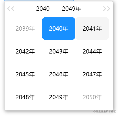
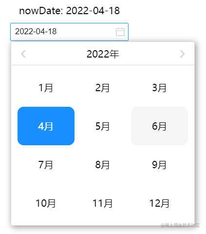
- Day, month, and year selection panel implementation Interactions: a. Day panel: Click a date to select it. Click left/right arrows in the header to navigate to the previous/next year or month. b. Month panel: Enter by clicking the month in the day panel header. Click a month to select it and return to the day panel. Click left/right arrows to navigate to the previous/next year. c. Year panel: Enter by clicking the month in the day panel header. Shows decades. Click a year to select it and return to the day panel. Click left/right arrows to navigate to the previous/next decade. d. Real-time date changes based on input field content.
- External API implementation
a. Default date setting via
defaultDate— set defaultDate to a moment object to configure the default date. b. Date retrieval viaonDateChange— use the date change callback function to get the current date, returns a moment object. Example:
class App extends Component {
  constructor(props) {
    super(props);
    this.state = {
      nowDate: 'No Value!',
    };
  }
  handleDateChange(date) {
    this.setState({ nowDate: date.format('YYYY-MM-DD') });
  }
  render() {
    return (
      <div className="App">
        <div>nowDate: {this.state.nowDate}</div>
        <DatePicker defaultDate={moment()} onDateChange={(date) => this.handleDateChange(date)} />
      </div>
    );
  }
}- Panel display and transition animations
Through the
picker-panelclass with initialopacityset to 0,transform-originset to top-left, initial size atscale(0), and display controlled via the custom attributedata-activeset to true.
.picker-panel {
z-index: 10;
position: absolute;
background-color: white;
top: 30px;
left: 0;
width: 300px;
height: 300px;
border-radius: 3px;
border: 1px solid $gray-4;
box-shadow: 2px 2px 10px rgba(0, 0, 0, 0.4);
display: flex;
flex-direction: column;
opacity: 0;
transform: scale(0);
transform-origin: top left;
transition: all 300ms ease-in-out;
&[data-active='true'] {
transform: scale(1);
opacity: 1;
}
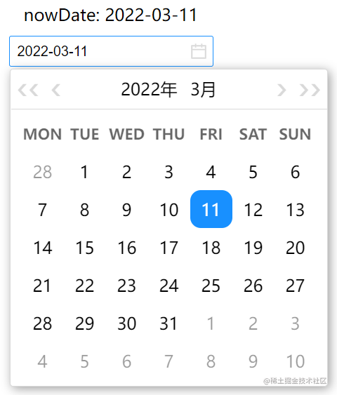
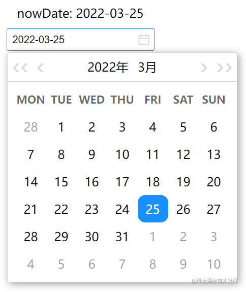
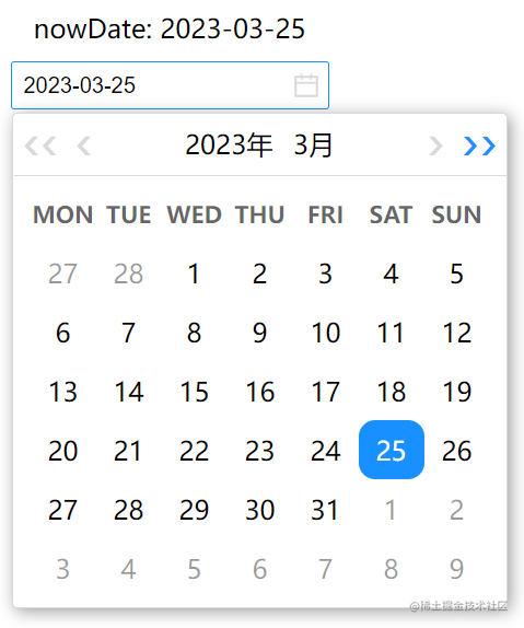
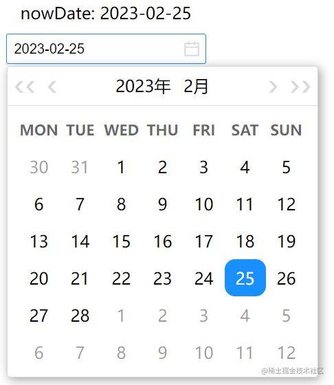
}- Interface Screenshots
- Initial value
-
Selecting another date
-
Next year
-
Previous month
-
Entering the year panel
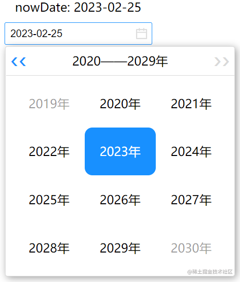
-
Switching year panels
-
Month panel
喜欢的话,留下你的评论吧~